
How's Your Headwind Today?
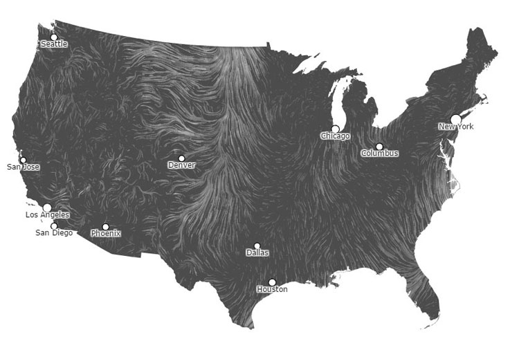
As folks start getting back on the water, and teams look to begin racing in the next 30 days or so, athletes and coaches are turning their minds from erg splits back to currents, tides and of course, wind.
We found this cool wind map online; a collaboration of Google data visualization engineers and artists Fernanda Viegas and Martin Wattenberg, the map updates hourly with data from the National Digital Forecast Database, and shows a visual representation of wind speeds and directions in the whole US. (The map is zoomable too, which is a bonus).
Conceivably, you could look at this map and roughly predict what everyone's racing weekend is going to be like...usually there are definitely some better places to race, and some definitely worse.
h/t hint.fm
If you enjoy and rely on row2k, we need your help to be able to keep doing all this. Though row2k sometimes looks like a big, outside-funded operation, it mainly runs on enthusiasm and grit. Help us keep it coming, thank you! Learn more.
Comments | Log in to comment |
There are no Comments yet
| |


- Bont Rowing
- Calm Waters Rowing
- Concept 2
- Craftsbury Sculling
- The Crew Classic
- CrewLAB
- Croker
- Dad Vail Regatta
- Durham Boat Co.
- Empacher
- Faster Masters
- Filippi
- Fluidesign
- h2row.net
- HUDSON
- myrow
- Nielsen-Kellerman
- Oak Ridge RA
- Peinert Boat Works
- Pocock Racing Shells
- Race1 USA
- Rockland Rowing Masters Regatta
- RowKraft
- Rubini Jewelers
- Vespoli USA
- WinTech Racing